01 / DIGITAL PRODUCT & SERVICE DESIGN
Carely
Making local childcare feel more personal.
A local babysitting platform connecting families and babysitters in Herzliya. As a co-founder, I contribute across UX/UI, product direction, branding, and marketing, shaping a service, not just a set of screens.
- MY ROLE
- Co-Founder, Product Designer & Marketing Specialist
- CONTEXT
- Self-employed · Collaborative product
- FOCUS
- UX/UI · Product · Brand
- WHAT I CONTRIBUTED
- UX/UI design and user journeys, product and service decisions, visual identity and brand communication, registration and interaction design, and close collaboration on product development.
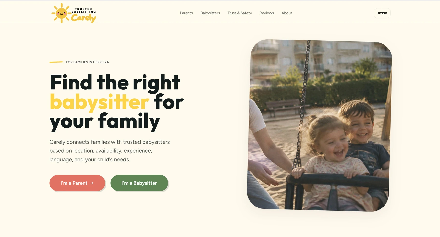
A good match needs more than a list.
Finding local childcare is a personal decision. Availability alone doesn’t explain whether a babysitter fits a family’s schedule, children’s ages, languages, and expectations.
We designed Carely around those needs, rather than a conventional directory. The aim: make the service understandable, local, and personal.
A human-supported service
Structured information supports potential matches, while personal review remains part of the intended service model. The interface needs to explain that process without promising automatic approval or a guaranteed match.
Two audiences. Two tailored journeys.
Parents need to communicate what their family needs. Babysitters need to share their experience, skills, availability, and expectations. We used different questions within a consistent interaction system.
For parents
Children’s ages, schedule, duties, and language preferences turn a broad request into useful matching criteria.
For babysitters
Experience and comfort with different ages help sitters describe the work they’re suited to, alongside availability and hourly expectations.
Source: Carely presentation, page 3. These screens show the designed registration journeys, not measured performance.
Ask for what matters. Make it manageable.
I contributed to simplifying registration by grouping related questions, using selectable choices, and making labels explicit.
Less typing, clearer choices
Visible choice chips let people review available options rather than formulate every answer from scratch.
Consistency across journeys
Shared patterns for labels and actions make the parent and babysitter flows feel like parts of the same product.
Why it mattered: parents and babysitters spend less effort, while we still collect the details a good match depends on. (The effect hasn’t been measured yet.)
Warmth without overpromising.
Childcare asks people to make a sensitive decision. I helped shape an approachable visual identity and consistent messaging across the website and marketing materials.
Trust also depends on clarity: how the service works, what information is requested, and what happens after submission. Our design approach emphasizes consent and realistic expectations, not unsupported claims about safety or verification.
One identity, across touchpoints
The warm yellow, coral, and green palette belongs to Carely. Friendly imagery and consistent typography connect the product to its community-facing communication.
My contributions include visual direction, Instagram content, and launch-related marketing activities, alongside the team’s product work.
More than a translation.
Carely is designed for English- and Hebrew-speaking users. My work includes supporting language-aware user journeys and appropriate right-to-left layouts.
Navigation, alignment, field labels, and messages need to work as a coherent experience in each language, not simply reuse an English layout with translated text.
Screens shown are from the English version of the registration flow.
The service continues after “submit.”
A registration experience is only one part of a matching service. Product requirements also need to account for application review, acknowledgment, matching criteria, and communication.
I contributed to product direction and experience design in a collaborative development process, with much of the technical implementation built through AI-assisted development in Lovable.
Thinking through what happens after someone presses submit turned the design from a set of screens into a service. Some of these steps are intended service workflows run by our team, not automated features.
Small details that set expectations.
Telling parents upfront that the request takes about three minutes, and showing which step they are on, makes a longer form feel manageable.
From the current website
Designing the experience, and the service behind it.
Building Carely has expanded how I think about product design. User needs, brand communication, business goals, and service operations all influence the interface.
My biggest takeaway: making an interaction easier is only part of the work. The service behind it must also be understandable, coherent, and useful.