02 / AI PRODUCT DESIGN · UX/UI · DESIGN SYSTEMS
Kolla
Making AI feedback clear enough to act on.
Kolla is an AI-powered document assessment and feedback platform. Working alongside the founding team, I helped shape its first usable product experience, turning complex AI-generated assessment results into an interface people can understand and act on.
- MY ROLE
- UX/UI Specialist
- TIMELINE
- January–June 2026
- TOOLS
- Figma · FigJam
- WHAT I CONTRIBUTED
- Brand identity, wireframes, user flows, interface architecture, interactive prototypes, and the design system with paired light and dark modes, working alongside the founding and engineering team.
Shape a first version, and a language that can scale.
The brief was to design the first version of an AI-powered grading and assessment tool and establish a visual language that could grow with the product.
A small founding team
I worked with the founders, a product manager, an AI engineer, and a developer. The AI technology and application code were built by the engineering team.
From structure to interface
Brand identity, wireframes, user flows, interactive prototypes, and interface design.
Design objective
Make complex AI feedback feel clear, trustworthy, and fast to act on.
A complicated output needed a simple experience.
Academic institutions and companies needed a faster way to evaluate documents (assignments, reports, and applications) using consistent, transparent criteria.
Complex AI output
Technical assessment results had to become something educators and students could understand immediately.
Simple workflows
Submitting a document and reading the result needed to feel short and predictable.
No design system yet
Designing at an early stage meant defining components, hierarchy, and tone from scratch.
The challenge: reduce complexity without making the AI feel like a black box. The work started with structure, hierarchy, and trust, not decoration.
Different goals. One interaction model.
Educators
Review and grade faster.
Students
Understand feedback and improve.
HR & recruiters
Assess documents consistently.
Shared requirements
- Upload documents easily
- Understand AI feedback clearly
- Review assessments quickly and accurately
Design implication: one simple path, repeated patterns, and readable feedback blocks.
Principles that filtered every decision.
Reduce cognitive load
Prioritize only the information needed for the next action.
Clear hierarchy
Make scores, feedback, and calls to action instantly scannable.
Predictable upload-to-feedback
Keep upload and analysis flows short and consistent.
Trust through consistency
Consistent components, spacing, and interface language build confidence.
A fifth principle, accessible by default, meant readable type, sufficient contrast, and parallel light and dark modes.
Enter. Choose. Submit. Understand. Improve.
The same mental model supports multiple modules, so users don’t need to relearn the product when they move from one tool to another.
Tech-forward, yet still academic.
Midnight navy foundations, electric purple and blue accents, and soft translucent cards make the AI feel modern without becoming visually noisy.
Component language: rounded cards, soft glow, compact labels, clear states, and restrained gradients, applied consistently across light and dark modes.
One structure, two modes.
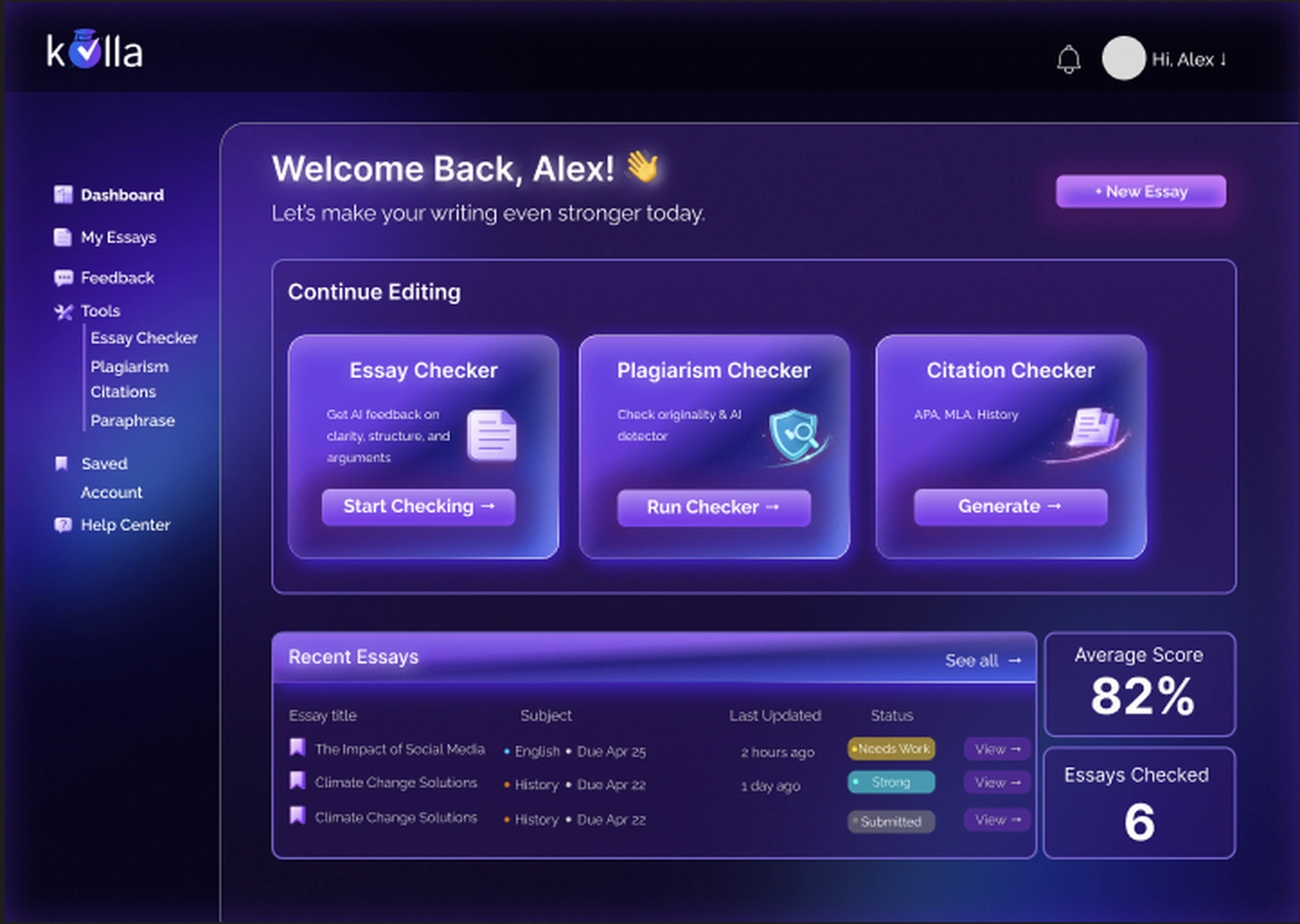
Dashboard
Product modules
Landing page
Concept designs. The “4.8/5 from 1,200+ students” rating and the “Trusted by high school students worldwide” line are placeholder copy written for the mockups, not Kolla performance data.
Login & registration
Original design screens from my Kolla presentation. Design deliverables, not a record of which features are live.
Structure that carries across tools.
Easier navigation between tools
Essay, plagiarism, and citation tools are one click from the dashboard, and navigation stays the same in every module.
Clearer feedback presentation
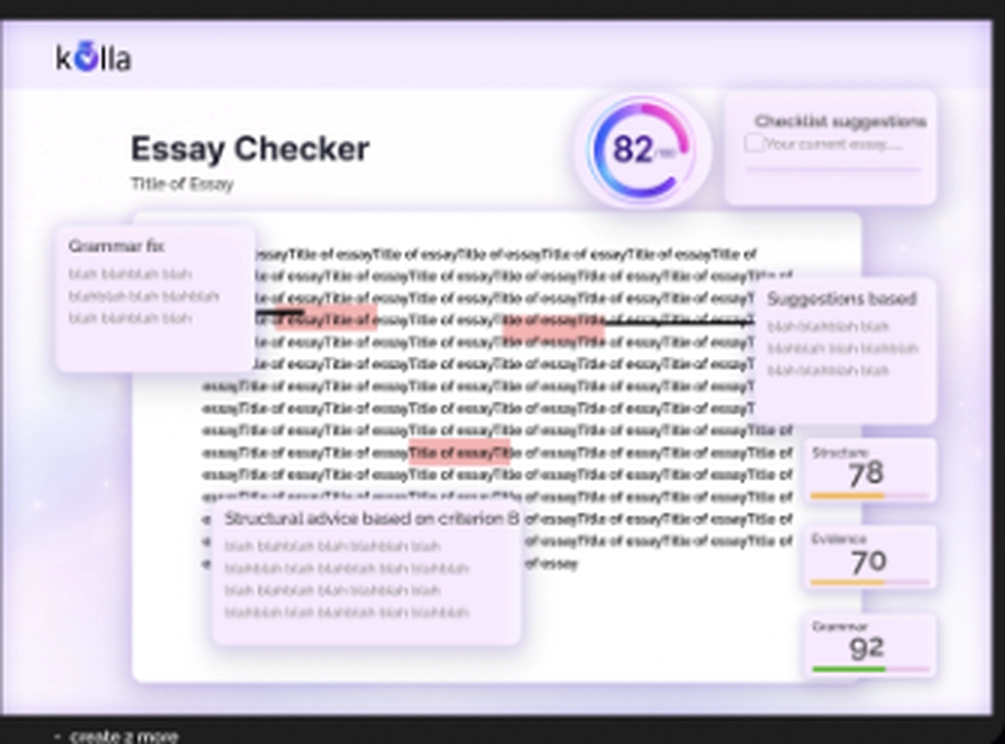
Scores surface as compact status cards; detailed feedback is grouped by category beside the text.
Reusable interaction patterns
Each module follows input → review → result, so controls and feedback conventions transfer.
Light/dark consistency
Screens were designed as pairs, keeping the same hierarchy in both themes.
A complete interface system.
By the end of the project, one design language spanned acquisition, onboarding, workspace, and assessment workflows, delivered as a full design system and interface set, reviewed in weekly sessions with the founders.
Designing AI means designing explanations, not just outputs.
A reusable interaction pattern is what makes a multi-tool platform feel coherent.
Light/dark parity works best when planned from the component level.