03 / ACADEMIC UX/UI & PRODUCT MANAGEMENT CONCEPT
Wix MobileSync
Your content is on your phone. Your website is on your desktop.
Our team explored how Wix creators could move mobile photos into their desktop editing workflow without repeated transfers, downloads, and re-uploads. MobileSync is a designed and tested concept, not an officially launched Wix feature.
- MY ROLE
- UX Research & Prototyping – Collaborative Team Member
- CONTEXT
- Reichman University · Academic final project
- STATUS
- Designed & tested concept
- WHAT I CONTRIBUTED
- As one of four team members, I contributed to UX research, usability testing, concept development, Figma prototyping, and design analysis. Deliverables were shared across the team.
Not just an upload problem. A handoff problem.
Our team identified a mismatch between where creators capture content and where they build websites. The presentation maps a workflow involving several tools before a photo reaches the editor.
Our design question: how might we help creators move photos from their phones into their site-building workflow with fewer intermediate steps?
Source: original presentation, slides 2 and 6.
Look beyond the upload button.
We combined think-aloud usability sessions in the Wix Editor with interviews, journey mapping, Jobs To Be Done, and secondary sources. These methods helped us examine both interface friction and the broader content workflow.
Usability observations documented by our team
Finding the starting point
Participants struggled to locate the upload entry point. This pointed to discoverability as a design question.
Understanding progress
The presentation reports uncertainty about whether an upload was working, highlighting the need for feedback.
Finding uploaded assets
Media organization made it difficult to locate files again after uploading.
Knowing what comes next
After upload, the next action, insert, replace, or organize, was not always clear.
Broader research themes
Our synthesis also included scattered content, repeated device switching, unclear file requirements, unexpected cropping or image quality, media-library organization, and layout shifts when replacing images.
We treated these as related opportunity areas. The selected concept addresses cross-device transfer, not every issue in media management.
Source: presentation slides 3–6. Findings are attributed to the team’s documented work; no participant quotes or research photographs are reproduced.
Two solutions. Different moments of need.
Save to Wix extension
A creator finds an image online and saves it directly to Wix Media Manager with a right-click action.
Strength: fits desktop web browsing.
Trade-off: requires a browser-specific extension; doesn’t directly address photos already on a phone.
QR-based MobileSync
A creator scans a code on desktop, selects photos on their phone, and sends them into the proposed media workflow.
Strength: addresses phone-originated content without an extension installation.
Trade-off: still needs a discoverable entry point and a clear device handoff.
Why our team selected MobileSync
Our research highlighted the gap between mobile content capture and desktop site creation. QR-based upload aligned more directly with that problem. The extension remained a complementary concept for a different workflow.
From research to design
- Content starts on the phone, work happens on desktopQR handoff that begins inside the site editor
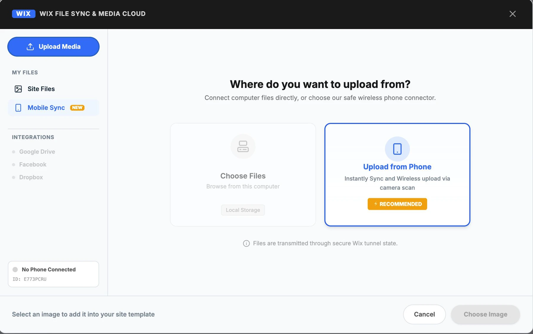
- Participants struggled to find the upload entry point“Upload from Phone” offered next to the familiar file option
- Uncertainty about whether an upload was workingConnection status shown on the QR screen
- The next action after upload was unclearSuccess screen points the creator back to desktop
Source: presentation slides 8–10. These are design intentions, not verified claims of universal browser compatibility or production performance.
Start where the creator is already working.
We designed the proposed journey to begin from an image in the site editor. The upload choices expose a phone-based option, followed by QR instructions that guide the handoff.
The QR view combines connection status with instructions. The security and speed wording on this screen is prototype copy.
Original prototype screens / presentation slide 11.
Select. Send. Return to your site.
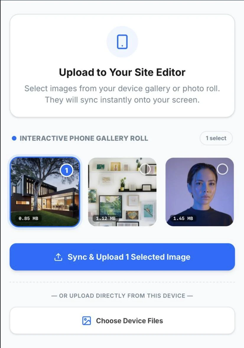
The phone-side journey uses visible selection states and an action tied to the selected image. A success view then directs attention back to the desktop editor.
The interaction decision: make the selected state and next action visible, then close the cross-device loop with explicit guidance.
Original prototype screens / presentation slide 12. Concept interface, not a live Wix integration.
A shorter journey still needs a clear beginning.
We tested the concept through task-based think-aloud sessions and reviewed the funnel analysis included in our team presentation. The useful design questions concern upload discovery, QR connection, and first-time guidance.
We report qualitative findings here. Funnel stages showed us where to look next, but not why someone stopped, which is what the next round of testing should answer.
The entry point matters
A cross-device solution only helps if creators find it. Upload-entry visibility is a priority for further testing.
Connection needs guidance
The team’s reflection identifies QR discovery and first-time onboarding as areas to refine and retest.
Source: presentation slides 13–17. Recommendations are not evidence of a rollout or measured improvement.
Solve the workflow, then test the handoffs.
This project reinforced the value of reframing an interface complaint as a wider workflow problem. Comparing alternatives helped us select a concept that matched where the content originated.
Our proposed next steps are to test upload-entry visibility, clarify QR onboarding, and evaluate whether creators understand what to do after sending their photos. These are future questions, not completed redesigns.
A shared design process
Ariel Weinberg, Shira Dichovski, Amit James, and I worked collaboratively across research, usability testing, concept development, Figma prototyping, and analysis. There was no strict division of deliverable ownership; I was an active contributor throughout the UX/UI process.